22 creative ways to start increasing online sales today

If you hope to increase your sales, you are on the right track.
Increasing sales is the key to the success of any business. But rapid revenue growth is not the only benefit you will gain from it.
The increase in sales has an exponential value.
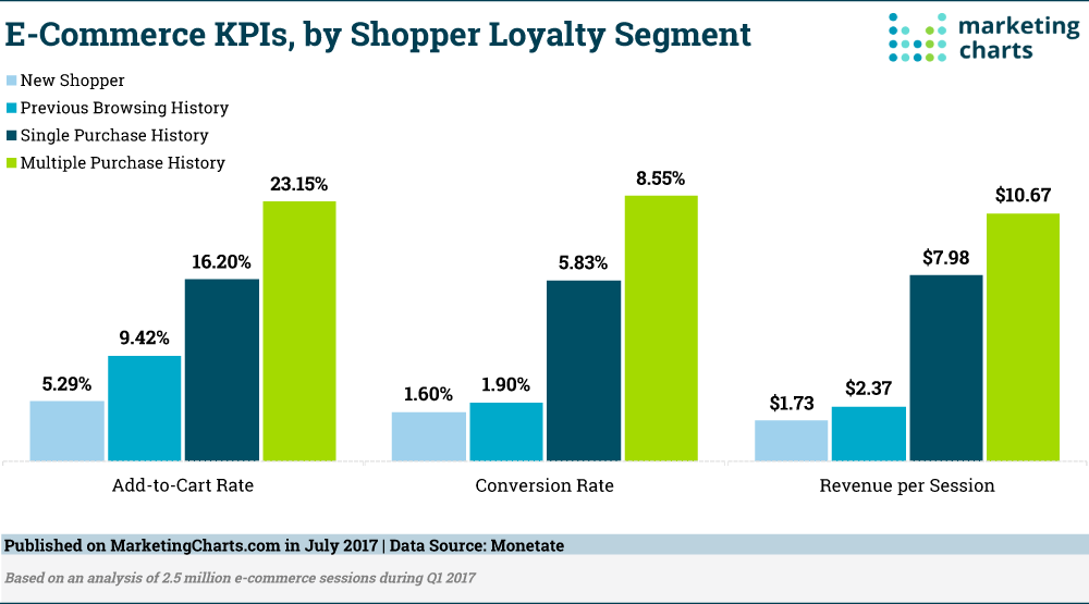
According to research conducted by Monetate, loyal buyers are worth 5 times more than their counterparts who are making their first purchase.
By adding subsequent sales to this initial sale, you can completely change the way your customers interact with you.
It is essential to make as many first sales as possible, and then continue to improve your funnel in order to effectively sell to as many new and existing customers as possible.
In this article, I will show you 22 creative ways to start increasing your online sales.
Let's get started!
1. Remove sliders from your homepage
If you have been following the latest website design advice, you have probably at least considered including a slider image on your homepage.
It is a popular movement with some benefits.
You can display a variety of products and features, and this seems to be a welcoming way to introduce new visitors to the content you have to offer.
But if you want to increase your sales, you must remove it immediately.
There are no studies showing that it increases sales, and there is plenty of evidence showing that it confuses customers and drives them away.
When Siemens tested its rotating carousel, users did not recognize that there was a discount on washers because the image changed too quickly.
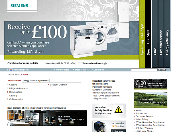
Fortunately, it was only a test, and we can learn from Siemens.
Instead of including a large rotating carousel or changing slider on your homepage, focus this valuable above-the-fold space on promoting your most important message.
2. Indicate which plan is the most popular
People like to do things that others appreciate.
This simple psychological principle is known as the bandwagon effect. Essentially, people consider a group of similar individuals as experts on a subject.
That is why marketing specialists constantly use phrases such as "the number one brand in America" or "recommended by most doctors".
These statements add social proof to the product and influence the decisions we make. They also give us a sense of community with our choices.
We are less likely to make a bad decision, we reason, if others have chosen the same thing before us.
To use this effect to your advantage, you must highlight the most popular plan or option on your pricing page. Do not be afraid to promote it.
AdEspresso clearly indicates which plan is the most popular on their pricing page.
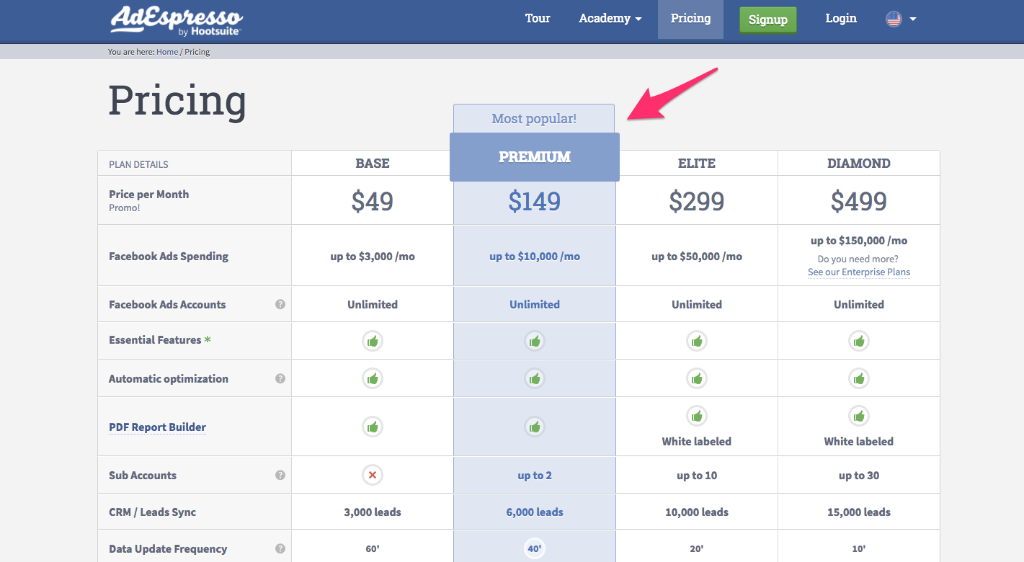
They have included a "most popular" banner, increased the size, and changed the color of the entire option.
3. Enter your contact information
If you are a B2B company, the best tactic to increase your sales could be a simple strategy that you have never considered.
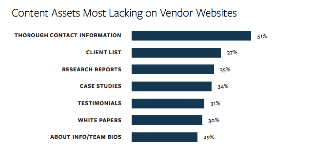
Although you may not expect it, the lack of detailed contact information is regularly cited as a common frustration by potential clients.
According to KoMarketing data, the #The most lacking content on supplier websites is contact information.
Even if you prefer to sell through a section of your website dedicated to e-commerce, many B2B customers prefer to personally contact a sales representative.
Make sure to include as many contact details as you are comfortable including online. At the very least, you should include an easily accessible contact form.
For even greater sales, consider including a phone number, a complete postal address, and an email address.
As this is a feature sought after by many visitors, it is wise to include this information on every page of your website.
4. Use an inspiring floor plan name to encourage upgrades
When a customer decides to choose one of your pricing plans, they will likely be looking for the details you provide to them to gather clues that could influence their choice.
By giving an inspiring name to your most cherished plans, you can increase the conversion rates of these plans.
MailChimp provides an excellent example of this effect in action. MailChimp offers three plans: a free plan, a low-cost plan, and a high-cost plan.
A few years ago, the plans were named "entrepreneur", "growing business", and "bulk shipper".
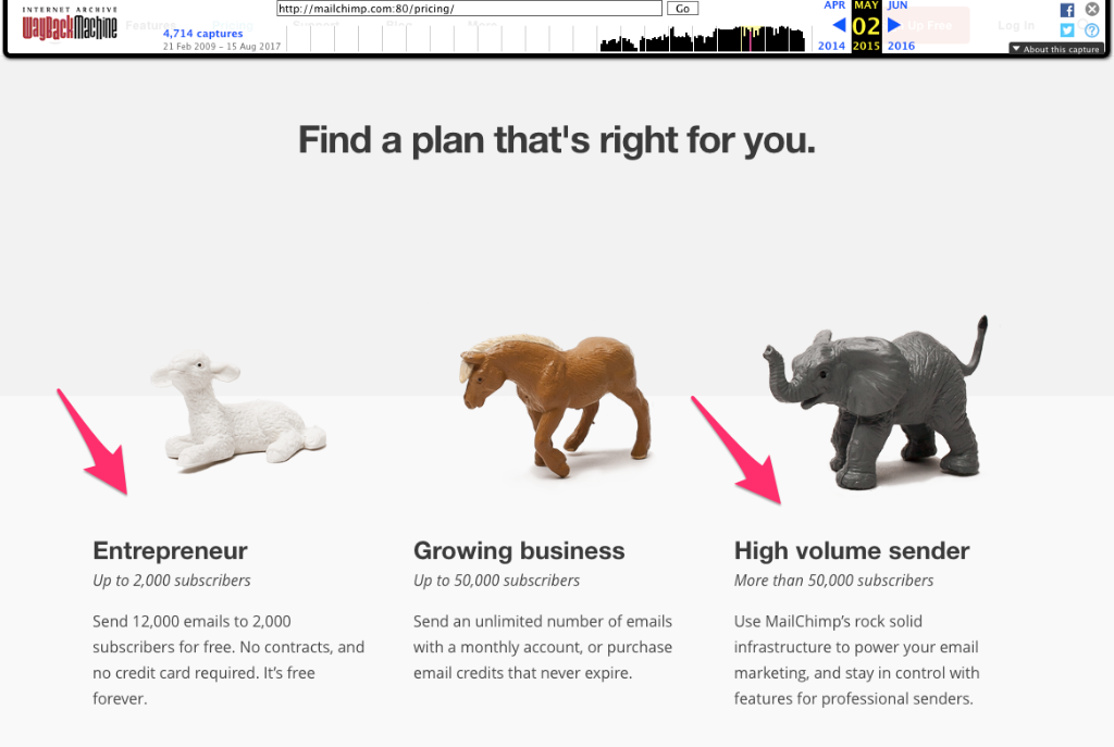
If this strategy has worked well, the term "entrepreneur" is a compliment for most small business owners and indicates that the free plan is a good starting point.
Furthermore, the term "high-volume sender" refers to a person who sends thousands of emails and clogs the inboxes of their recipients.
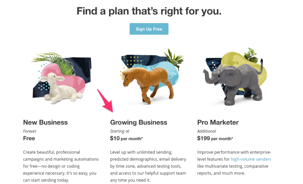
Today, MailChimp has modified the terms of their plans.
They have also made some changes to the page. I will talk to you in more detail about the redesign later.
Now, they use the term "new business" for the free plan. But even the newest companies want to consider themselves as growing, that's why these names encourage people to upgrade to grow.
And instead of being senders of large volumes, their premium members are now "pro marketers", a label that any client would be happy to accept.
5. Remove references to the purchase above the fold
Sometimes, you have to convince your customers to start using your product before even talking about price.
If someone is completely sold on your product, the price will be less important than if you start by explaining your plans and costs upfront.
To do this, remove all references to purchasing above the fold on your website.
Many websites have a "price" option in the top navigation. If you currently have it, try testing a version of your website without the "price" option in the navigation.
Evernote does an excellent job of promoting their product without mentioning sales on their front page.
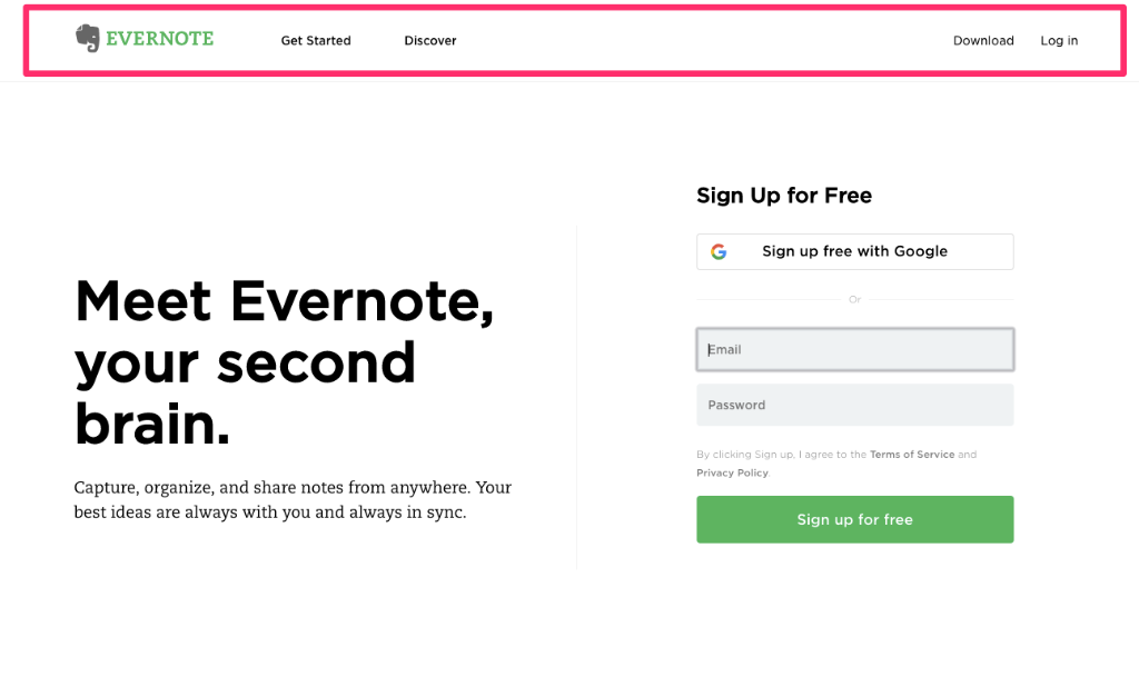
The header navigation bar does not include the words "price", "plans", or "buy", and they are not mentioned anywhere else on the page.
Instead, significant real estate is dedicated to encouraging new users to sign up for a free Evernote account.
By heavily promoting their free subscription, Evernote has become the industry standard when it comes to note-taking applications.
The company continues to make significant profits thanks to users who pay for the full package after experiencing the free features of Evernote.
6. Match your homepage to your ad
If you are using paid ads as part of your sales strategy, there is a simple modification that will increase your conversion rates and skyrocket your sales.
Instead of testing multiple ads and landing pages separately, it is necessary to work on correlating them. This congruence will encourage users to sign up and purchase the products you have for sale.
As Raphael Paulin-Daigle writes on WordStream, there are two parts to matching a landing page to the ad.
Firstly, there is the matching of scents. Your landing page should closely resemble the layout and color palette of the ad you are using to promote this landing page.
Secondly, pay attention to message consistency. You should market the homepage with the same text (or at least the same focus) as your ad.
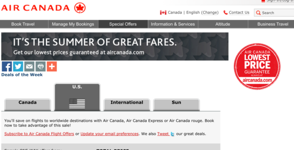
Here is a good example, Air Canada. They are promoting low prices with the phrase "It's the summer of great fares" in their advertisement.
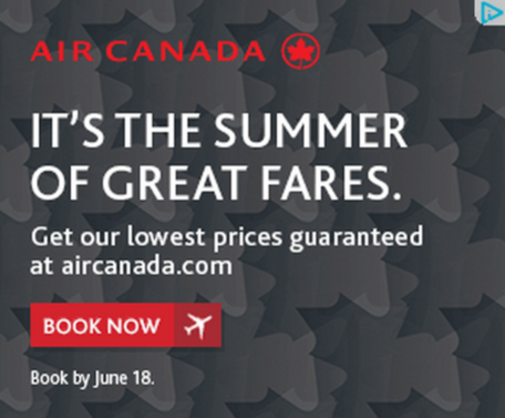
This copy and the grey background pattern are repeated on their homepage.
By maintaining the correspondence between the scent and the message, you can increase the sales of your paid advertisements.
People feel more comfortable when they feel the alignment of your message and your visual brand.
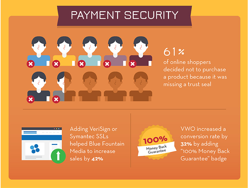
7. Display trust icons on the payment page
Establishing trust is one of the psychological keys to use to skyrocket your sales.
In a study, a shocking 61% of online shoppers decided not to make a purchase because a website did not have a trust seal, according to Acquisio.
It's as important as that!
There are several ways to inspire trust and ensure security on your payment page. First, include a basic trust message, such as a brief description of your security measures.
Zappos uses multiple trust signals, such as these two on their payment page.
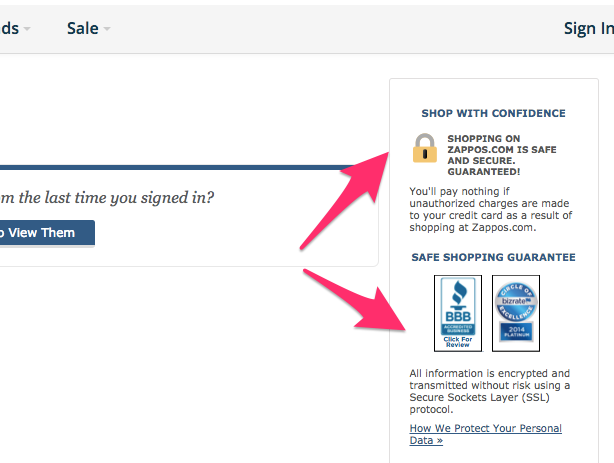
They reassure potential clients about the security of their information and even provide a link to a detailed description of the security measures they use on their site.
But to go even further, you can include a certified trust seal. To do this, you must get verified by a third-party provider. You will then have permission to display their badge.
Although it boosts your sales, it can be costly to have a security seal placed on the website of these companies.
If you are unsure of which to choose, research has shown that Norton has a higher level of trust than any other seal.
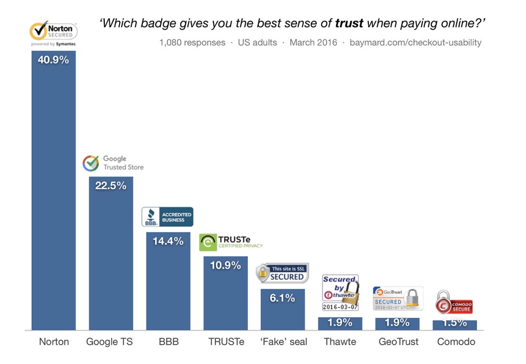
By proving that you can be trusted with a client's sensitive credit card information, you will skyrocket the number of sales you make.
8. Attach images to your testimonials
Just as we prefer to purchase the most popular option or plan, we also want to make sure that other people have also found success with the product.
I have already spoken about the impact that testimonials can have on increasing sales on your website.
But to move on to the next step, you can include an additional verification of your social proof.
In other words, include photos and other information that allows for identifying the individuals who have supported your product or service.
Images of the people writing the quotes are the most effective.
This proves that you did not invent the testimonials, and it also allows users to establish a connection with the people who wrote these testimonials.
By providing contact information, potential clients can even get in touch and verify that the testimonials are valid.
Bizzabo includes photos and Twitter usernames for people who support their product.
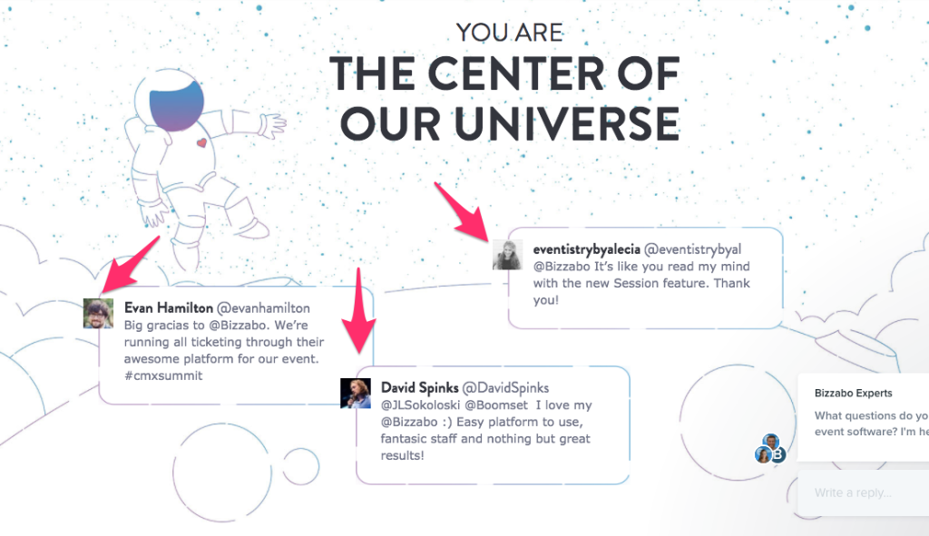
It is a powerful form of social proof. You are indicating that not only are your testimonials real, but that you are happy to allow curious visitors to contact the people who have endorsed your product.
9. Create a sense of urgency
If your sales page is about an airplane, urgency is the fuel that propels it into the stratosphere.
By setting a deadline for a promotion, launch, or sale of your product, you can boost sales from people who would normally wait to purchase later.
Of course, people who wait tend to not buy at all. Instead of hoping they will eventually make a decision, you should provide them with a compelling reason to invest now.
The urgency is how you do it.
Marcus Taylor experienced an increase in demand for his offer: a complete promotion package for musicians, including recording time and iTunes distribution.
The first version of his sales page did not contain any urgency.
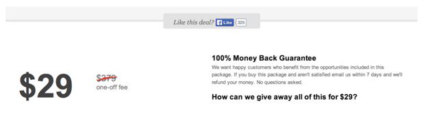
He created a second version that included three emergency triggers. First, he had a "Time Left to Download" button that counted down to the deadline.
Then, he indicated the number of packages that had already been purchased. Since the number was limited, this increased the urgency.
And finally, he included a status on the offer. With all the pieces in place, his second version looked like this.
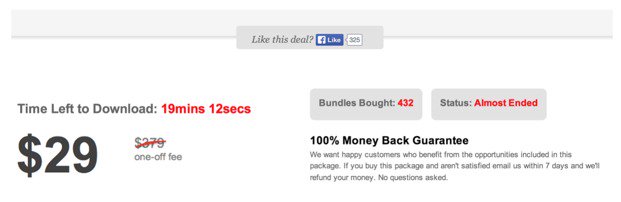
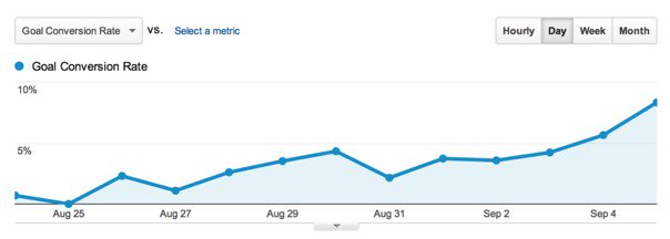
This second version has been a huge success, reaching a conversion rate of nearly 10%.
Adding an emergency indicator, even minimal, can have a significant impact on the success of your sales.
10. Offer a money-back guarantee
For customers who are struggling, you must provide them with a way to ensure that they complete their transaction as satisfied customers.
One of the most effective ways to achieve this is to offer a money-back guarantee.
This is essentially a promise of a full refund of the purchase if a series of conditions are not met.
Common conditions include customer satisfaction with the product, price adequacy, or even the results the customer gets with the product.
Although you should not promise a guarantee that you cannot keep, the firmer the promise, the more it will increase your sales.
Hotels.com
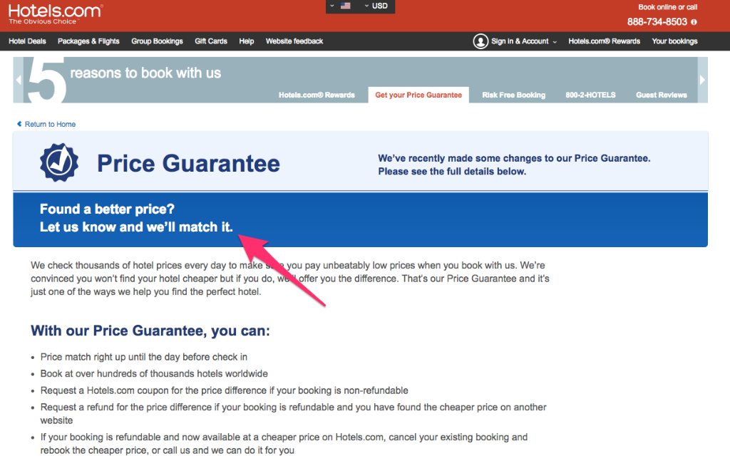
By promising its customers to always get the best price, Hotels.com gives them a sense of confidence in their purchase and encourages them to sell more.
One of the great advantages of a warranty is that few customers will benefit from it, even if they are not satisfied with the product because it is a problem.
11. Remove steps from the payment process
Simplifying the payment process is an excellent way to ethically boost your online sales.
Amazon has collected an incalculable number of dollars thanks to its one-click ordering option, and for one simple reason: We are lazy.
When I say "we", I mean you, me, and your clients.
Every additional step in your payment process makes it more complicated to complete, and adding it to this process will scare away a fraction of your potential buyers.
Research conducted by the Baymard Institute has shown that 27% of cart abandonments are due to a complicated or prolonged checkout process.
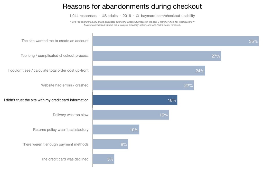
There are several ways to recover these 27% of customers.
First of all, you can include all the details of your order on one page. Each new page increases the likelihood that a person will abandon the payment process.
Next, you can hide the options until potential customers enter the previous information. For example, you can present a form that only asks for an email address and a name.
Once a customer has filled them out, the details of their credit card appear. And finally, the shipping information appears after the credit card details.
This reduces friction at the checkout and will increase your sales.
12. Remove the navigation bar when checking out
Whenever you give a customer the opportunity to step away from the payment process, you risk losing a sale.
Instead of customers clicking from checkout to their cart (which they may ultimately abandon), you want to move buyers from one page to the next in a seamless flow.
One of the simplest ways to do this is to remove the navigation bar from the payment process.
VeggieTales, a cartoon program for children, achieved a 14% increase in revenue per visitor by simply removing the navigation bar during the checkout process.
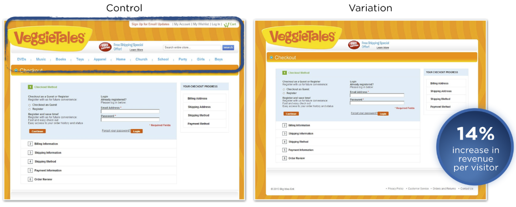
By forcing users to continue the ordering process or leave the site, you will naturally create a flow towards a successful order.
If you have other links on the payment pages leading to other destinations on your site, remove them as well. The payment funnel should be as smooth as possible for navigation.
13. Use your customer's voice in your copy
The best way to sell is to speak directly to your customer. And the best way to attract them is to use their voice in your language.
Of course, it can be difficult to directly quote your potential client.
But if you conduct enough interviews with existing clients, you will be able to discover the main reasons why they purchased your product or service.
Thanks to these struggles and common reasoning, you can create a sales page that converts better than anything you've ever written before.
FreshBooks knows that small business owners want accounting to be easier and faster. Their first iteration uses language that business owners would use themselves.
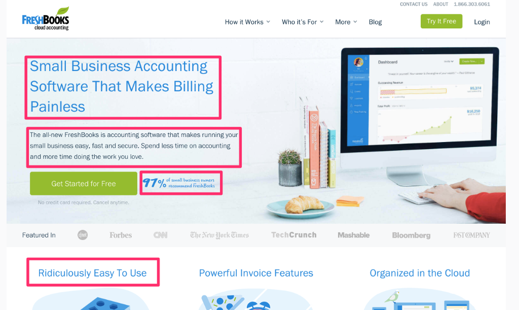
This copy is convincing because it uses language that business leaders have likely said to themselves at some point.
To include this type of sales-generating copy on your website, review customer testimonials or even schedule interviews with satisfied customers.
Understanding exactly what they are searching for and what their current frustrations are. If possible, obtain exact quotes on what is frustrating them.
Use these quotes (or paraphrase them) to create copy that converts more sales than you ever thought possible.
14. Selling over a longer period
One of the fastest and easiest ways to sell more is to sell over a longer period of time.
If you are in the services or SaaS sector, you probably sell on a monthly subscription basis.
However, for your most committed future buyers, you can encourage them to invest in an annual plan rather than a monthly plan.
In general, these annual plans are discounted. But since they guarantee a larger total revenue stream, they represent a good deal for businesses.
On your sales page, mention your annual plan. Make sure to provide compelling reasons to pay annually.
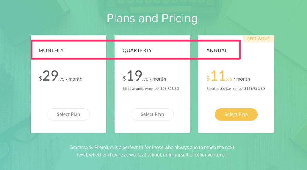
Grammar is sold in three different ways: monthly, quarterly, and annually. By selling their annual subscription at just over 1/3 the price of their monthly subscription, they encourage sales.
Although it may be more difficult to implement for products, consider creating a product renewal offer through a subscription on a frequent basis.
If you are selling a disposable item like soap or a line of products like clothing, you can easily create a subscription model to take advantage of this lucrative sales strategy.
15. Test the display of your title in two steps
If you have probably heard that you should do a separate test of your headlines, you may not have heard that you should also do a separate test of how you display your headlines.
The image and the text surrounding it can significantly impact the conversion rates of your sales pages.
Mindvalley started with this headline...

They had hypothesized that the smiling faces next to the title were distracting from the words, so they removed the image and focused on the text.
This version achieved a 7% increase in opt-ins. But instead of completely removing the images, they decided to add a subtle background image and split the title into two lines.
This version has outperformed all other tests they have conducted on the headline, receiving a massive increase of 230.41%.
By modifying and testing the titles you use to promote your products, you can encourage more visitors to take interest in what you are selling and to buy more.
16. Use live chat
Although the ideal situation is to address all customer objections in your copy, this is sometimes impossible.
Each client has a different question, and it is impossible to answer all questions all the time.
What is the solution? Install a live chat application on your sales page. This allows customers to interact quickly with you and get a response to their burning questions.
Since most customers do not directly ask their questions via email or other means, it is a great way to increase conversions by addressing objections.
A number of companies have experienced huge success with chat applications. Intuit increased their conversion rate by 211% by adding a chat function.
Currently, mHelpDesk uses a chat application to increase sales and respond to questions.
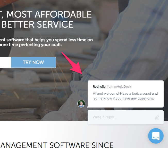
A typical feature of chat applications is a question asked by default to the visitor.
mHelpDesk does an excellent job of making this presentation non-confrontational and eliminating any appearance of sales talk.
By simply asking the visitor to "look around" and to discuss if they have any questions, they discovered a simple way to encourage discussion without pushing a product.
17. Include social proof
I have mentioned social proof several times in this article. And even though mentioning your most popular articles and including testimonials is great, nothing beats live social proof.
This is a new feature that allows you to include a pop-up window that informs visitors about recent purchases of your product.
Generally, these are small notifications that appear in the bottom left corner. They usually indicate the user's name, their photo, and the product they purchased.
Reference pages include social proof on their pricing page. The options constantly display recent purchases, ranging from a few hours to a few days ago.
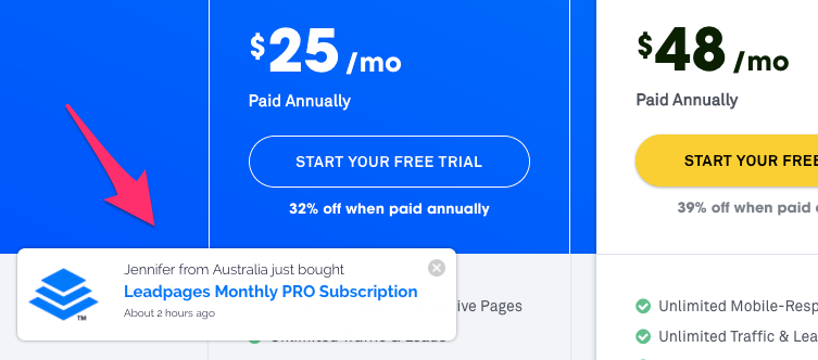
For someone who is indecisive about your product, this can be a powerful motivating factor. It shows the recent purchases and demonstrates that your product is currently popular.
A great tool that you can use for this purpose is the Proof application.
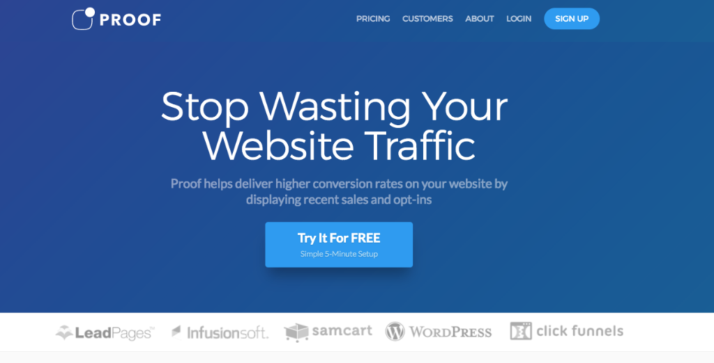
Proof integrates into most sales pages and home pages to create a user-friendly experience that encourages sales.
18. Use a personal call to action
If you are using a generic call-to-action button, it may be time to try something new.
Instead of using general language, choose an action with a personal touch. Consider using a first or second person pronoun like "my" or "you".
This wording of your button looks less like a cold command and more like a recommendation from a friend or even the internal dialogue of your prospect.
Shopify
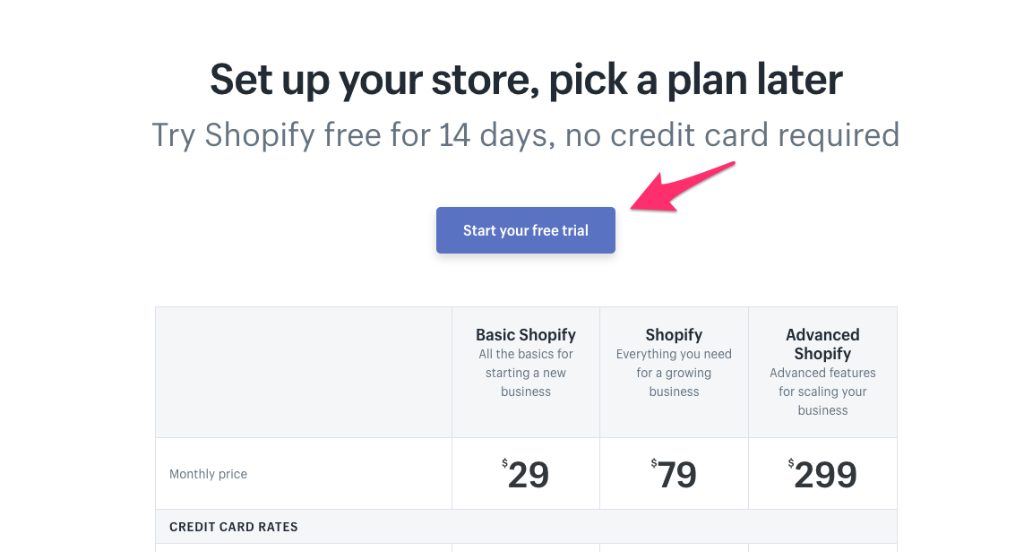
As always, I recommend trying out a few different options.
Try to use copy that speaks to your client (as in the example of
You can also try more familiar terms such as "oh heck yes," as Jon Morrow writes on the homepage of his guide to getting published in Forbes.
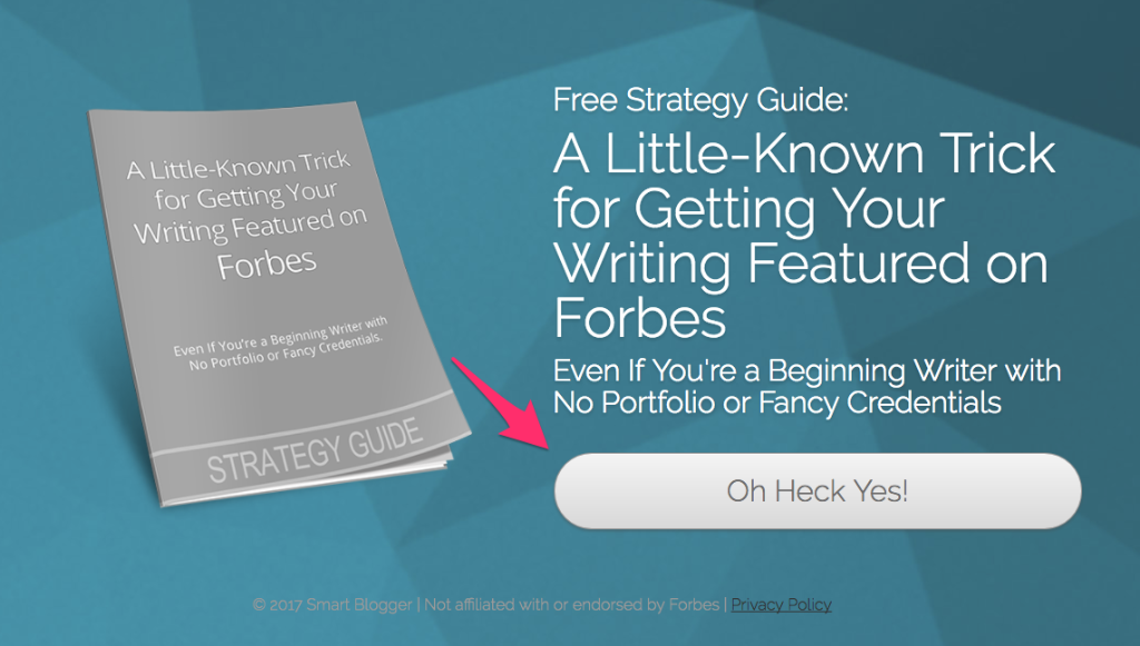
Because it is unexpected, this occasional button copy can grab your visitor's attention, encourage purchases, and increase sales.
19. Recommend a plan or an option
If you have a series of plans or options, users can quickly feel overwhelmed and not know what to choose.
It may seem smart to confuse your visitors. If they are not sure about the features, they will buy the most expensive option, just in case, right?
But this turns out to be false. When users are confused, they simply leave your site.
If you really want to boost sales and conversions, you need to make the purchasing process as simple as possible.
The best way to proceed is to choose a plan and openly recommend it. Give a reason why you think it is the best for the user and watch this option become the most purchased.
Freshdesk includes a recommended plan. They even include an animated windmill to draw attention to it!
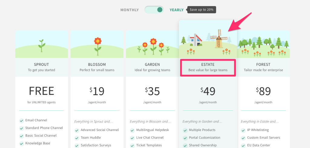
Notice that Freshdesk doesn't just say "buy this one". Instead, they provide a reason with the phrase "The best value for large teams".
As their user base includes organizations with large teams, this will immediately catch the attention of their visitors.
And if "value" is a subjective term, the company's recommendation (which clearly knows the product) provides an additional level of authority for the plan.
20. Reframe your ads to reach more customers
If you do not retarget your ads, you are missing out on a huge opportunity.
If a visitor comes to your site, you must develop a targeted advertising campaign to reach them as soon as they leave. Otherwise, you are just leaving money on the table.
To achieve the best results with retargeted ads, you need to create personalized ads to attract personalized audiences.
For example, let's say you are the owner of an online bike store.
You need to display a set of targeted ads to potential customers who add road bikes to their cart, and different ads to those interested in mountain bikes.
This type of personalized and retargeted advertising can be worth the investment and generate tremendous sales.
You can boost sales overnight with the right Google AdWords campaign. Luxury watch company Watchfinder achieved a 1,300% return on investment through ad retargeting.

You will notice that different types of watches attract different types of customers depending on the type of watch that interests them the most.
Try different types of targeted ads and adjust them based on the return on investment of the ad.
21. Improve your design
If your website looks outdated, you will lose valuable customers.
To maximize the number of sales you make on your website, consider hiring a professional designer to give your sales page a fresh look.
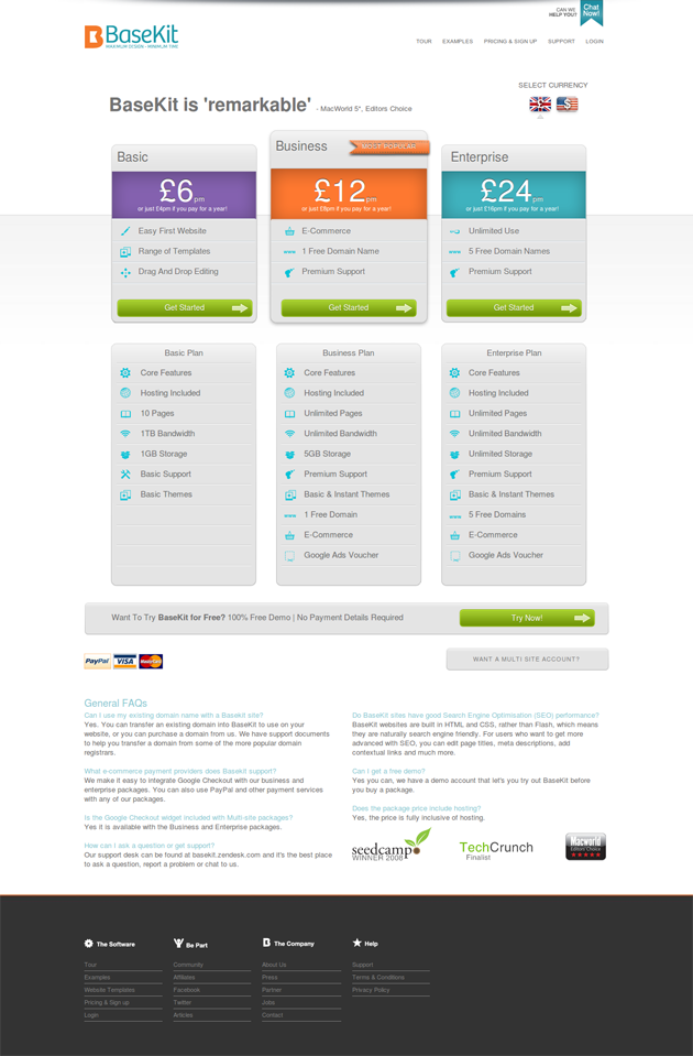
Basekit increased conversions by 25% by using brighter and bolder colors on their sales page. On their original page, the dark gray plan categories blended into the light gray background.
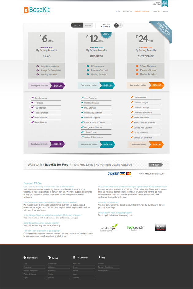
When they revised it, they included brighter colors for each plan and added a colorful "Get Started" button.
I have already mentioned that you should constantly make progressive changes to the design of your website to improve conversions.
For this, no place is more important than your sales page. I recommend using it optimally to gradually improve the layout and increase your sales.
If you are just starting out, I recommend including bright colors in your designs, making call-to-action buttons more distinct, and highlighting a popular or recommended plan.
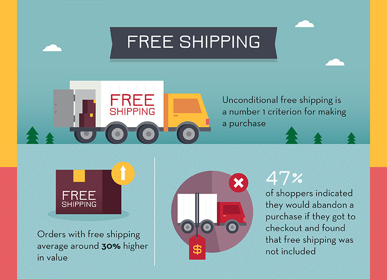
22. Offer free shipping
Although this option is probably the most expensive on the list, it is the most promising one.
Research conducted by Acquisio indicates that 47% of buyers would abandon a cart if they were able to proceed to checkout and found that free shipping was not included.
This represents almost half of your potential buyers!
If you really want to increase your sales, you need to find a way to prevent customers from leaving due to your shipping policy.
There are several ways to try this.
Offer free shipping.
Inclure discrètement le transport dans le prix. Si l’augmentation de vos prix vous inquiète, l’attrait de la gratuité des transports peut compenser cette situation. Envisagez d’ajouter un dollar à chaque article et utilisez les recettes pour couvrir les frais d’expédition.
Proposer un transport maritime forfaitaire. Si vous ne pouvez pas offrir la gratuité de la livraison, envisagez une option forfaitaire. C’est un moyen facile pour les clients de comprendre qu’ils devront payer les frais de port, mais cela ne permet pas qu’un prix inattendu fasse dérailler l’achat en milieu de caisse.
Conclusion
If you are looking to increase your online sales, you need to start trying techniques that your competitors have not yet thought of.
To do this, you will need to test both traditional methods and creative methods. Whatever you try, you must rely on the best research and make sure to test it yourself.
If it increases your conversions, keep it! Otherwise, move on to another way to increase your website's revenue.
What tactic will you use to increase your online sales?